Not Found
Not Found
Request path contains unescaped characters
Not Found
Not Found
Not Found
Not Found
Not Found
Not Found
Not Found
Not Found
Not Found
Not Found
Not Found
Not Found
Not Found
Not Found
Not Found
Not Found
Not Found

All comments

  • Earll• 50

    @Earllgits23

    Submitted

    What are you most proud of, and what would you do differently next time?

    Judgment of using font-size, padding, and margin.

    What challenges did you encounter, and how did you overcome them?

    On how can i make the shadow-box moved when h2 is on active state.

    What specific areas of your project would you like help with?

    Need to learn more basic foundations

    P
    Moa Davou• 220

    @moadavou

    Posted

    Great work on this challenge! Here are a few suggestions for improvement:

    • Use semantic HTML. Use <main> instead of <div> for the container and use <article> for the card.
    • If you have a <h2> on your page, you'll need a <h1> above it. If you don't want it showing, add a visually-hidden class.
    • Don't write your font-size in px. You want to use rem so that your site adapts to the user's settings.
    • To fix the active and hover effects you'll need to add:
    h2:hover, h2:focus {
    color: var(--yellow);
    }
    
    .container:hover, .container:focus {
    box-shadow: 20px 20px;
    }
    

    :hover is a pseudo-class that gets applied when the user hovers over the element. :focus is a pseudo-class that gets applied when the user focuses on the element, for example when the user navigates the site by using the keyboard.

    You have used the :active pseudo-class which represents an element (such as a button) that is being activated by the user.

    Marked as helpful

    3
  • P
    Moa Davou• 220

    @moadavou

    Posted

    Great work on this challenge! Here are a few suggestions for improvement:

    • Use semantic HTML to put more meaning into your elements and make a more accessible website. Wrap all of the content inside a <main> and use <article> instead of <div> for the card.
    • Add an alt-text on the images to improve accessibility.
    • Don't use px for font-size. Use rem instead, since this unit scales with the user settings.

    Marked as helpful

    1
  • iamporrrrrrrrr• 100

    @iamporrrrrrrrr

    Submitted

    What are you most proud of, and what would you do differently next time?

    None

    What challenges did you encounter, and how did you overcome them?

    None

    What specific areas of your project would you like help with?

    None

    P
    Moa Davou• 220

    @moadavou

    Posted

    Great work on this challenge! Here are a few suggestions for improvement:

    Make use of semantic HTML:

    • Wrap all of the content inside a <main>
    • Use <blockquote> for the quotes
    • Use <article> for the cards.
    0
  • ricky• 140

    @thekid2005

    Submitted

    What are you most proud of, and what would you do differently next time?

    i make the mobile :)

    What challenges did you encounter, and how did you overcome them?

    doing the mobile

    What specific areas of your project would you like help with?

    if you have sugestions for the mobile and youd like to help me, dont esitate

    P
    Moa Davou• 220

    @moadavou

    Posted

    Great work! Here are a few suggestions to improve your code:

    • <h1> has to come before <h2>. h1-h6 is used to create a table of contents (of sorts) for the page. It can be very confusing if they are not in order. You can wrap the first or second part of the title in a <span> to style it.
    • The cards are self-contained pieces of content. You should therefore use <article> instead of <div> to contain them.
    • You have a lot of repeated CSS for the cards. You can target multiple CSS classes at once, or take advantage of inheritance and put the styles on the .card class.
    • You are meant to use grid and not flexbox to position the cards.

    Marked as helpful

    2
  • P
    Moa Davou• 220

    @moadavou

    Posted

    Great work on completing this project!

    • In your HTML you wrap the h1 and h2 tags in a div. This is unnecessary since you can just put the id on the h1 or h2 tag like this: <h2 id="location">London, United Kingdom</h2>
    • Class names have a higher specificity than id´s. I'm not an expert on this, but I believe that class names can be easier to use for that reason.
    • Don't use px for font-size. This unit is not responsive and won't change depending on the user's settings.
    • You can't set font-weight in pixels. Just use a number. For example: font-weight:700;
    0
  • Kerwin• 80

    @KerwinAngeles

    Submitted

    What are you most proud of, and what would you do differently next time?

    I proud that I can finally undesrtand how custom properties work and why is soo important use when with start a project.

    What challenges did you encounter, and how did you overcome them?

    The challenges was that I did not know how to place the buttons one above the other. I overcome them putting the buttons inside a div and then using the display block with a width of 100% to occupy all the space available in the card-footer.

    What specific areas of your project would you like help with?

    All is clear for now.

    P
    Moa Davou• 220

    @moadavou

    Posted

    Great work on this project!

    Here are a few suggestions for improvement:

    HTML

    • The article element should represent a self-contained piece of content that could be independently distributed or reused. However, in your case, it seems like you're using it more as a generic container (you have two instances of article). Consider using main instead for the article with the class name container-articles.
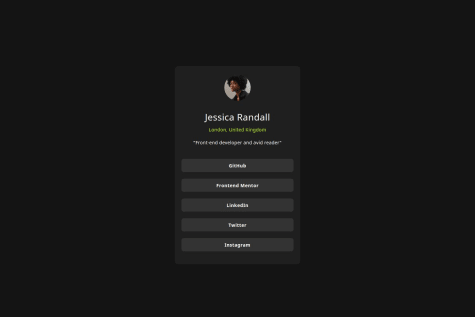
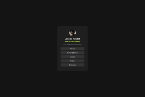
    • Alt text should provide a concise description of the image content. Consider describing the actual content or purpose of the image, like "Profile picture of Jessica Randall."
    • The button element is appropriate for interactive controls, for linking to websites, it's better to use a.

    CSS

    • Don't use px for font-size. This makes it so that the font won't change according to user settings.

    Edit: Quite a few mistakes were left in this response. I edited them out so that future readers don't get confused. Thank you @R3ygoski for taking notice!

    0
  • P
    Moa Davou• 220

    @moadavou

    Posted

    Great work on completing this challenge! Here are a few suggestions for improvements:

    CSS

    • The design is not fully responsive on 320px. Add a margin outside of the .article to solve this.
    • The .section is unnecessary. You can do this with just the main.

    Marked as helpful

    0
  • P
    Moshiur• 180

    @codermoshiur

    Submitted

    What are you most proud of, and what would you do differently next time?

    Implementing everything I've learned about HTML and CSS to accurately replicate the product preview card component.

    What challenges did you encounter, and how did you overcome them?

    Ensuring that the design is implemented in a responsive manner; hence, use the browser developer tools to confirm responsiveness.

    What specific areas of your project would you like help with?

    Nothing specific, but any feedback is highly appreciated.

    P
    Moa Davou• 220

    @moadavou

    Posted

    Great work on completing this challenge!

    You should include a span with the visually-hidden class with the text of something like "Old price: ". Without it, the screen reader just reads two prices - it can be very confusing!

    0
  • P
    ikethedev• 100

    @ikethedev

    Submitted

    What are you most proud of, and what would you do differently next time?

    I would use a framework like tailwind

    What challenges did you encounter, and how did you overcome them?

    No challenges

    What specific areas of your project would you like help with?

    Nothing specific but I am always open to improvement

    P
    Moa Davou• 220

    @moadavou

    Posted

    Great work on this project! 🎉 Here are a few suggestions for improvements:

    HTML

    • You have a h3 before your h1. This is very confusing for accessibility since the h1-h6 is used as a table of contents.
    • The header tag should not be included in the main tag.

    CSS

    • Never use px for font-size or line-height. This makes it impossible for users to scale the font and is therefore bad for accessibility.
    • Quite a few colors are wrong. Make sure that you take a closer look at the design file.
    • Don't use a set px width for the cards. This is bad practice for making responsive sites. Use min-width instead.

    Marked as helpful

    0
  • agnese• 300

    @aggie-l

    Submitted

    What are you most proud of, and what would you do differently next time?

    I am proud I managed to finish this exercise close to the original design.

    What challenges did you encounter, and how did you overcome them?

    I think I had some challenges with positioning the component at start, but I searched online and managed to fix the issues.

    What specific areas of your project would you like help with?

    I would appreciate any feedback.

    P
    Moa Davou• 220

    @moadavou

    Posted

    Great work with this challenge! 🎉

    Here are a few recommendations:

    • Use the main and footer elements instead of div. Semantic HTML improves accesibilty!
    • Use rem instead of px for your font-size. Pixels don't scale with user settings. If you don't change this, the text will stay the same even if the user changes the browser settings for font-size.

    Marked as helpful

    0
  • P
    Moa Davou• 220

    @moadavou

    Posted

    Great work on this project! 🎉

    Here are a few suggestions:

    • Change the link to the actual repository and not your profile. I couldn't find your code, so I'll review the live site.
    • Add a linear-gradient to the product image. It's a bit darker at the top.
    • Add a box-shadow to the card. There is a small one in the preview.
    • Add a span with the class visibility hidden and the text "Old price: " to the old price to make the site more accessible.
    0
  • P
    KL• 220

    @TorHamm

    Submitted

    What are you most proud of, and what would you do differently next time?

    I have learned a lots from this project for example

    • how to use @media for responsive website
    • learned something about using child selector

    What challenges did you encounter, and how did you overcome them?

    It's took a while to understand about @media like the difference between device

    What specific areas of your project would you like help with?

    I think i did well here but if anyone know where i can improve i would appreciate if any give me advice about it.

    P
    Moa Davou• 220

    @moadavou

    Posted

    Great work! 🎉

    I think you should use responsive units instead of px. You did use rem on border-radius in your media queries, but, apart from that everything is in px.

    If someone increases their default font-size, your site will not display these changes appropriately. This is bad for accessibility. Try to use rem for at least font-size and line-height.

    Here is an helpful article about units and accessibility: The Surprising Truth About Pixels and Accessibility

    Marked as helpful

    1
  • P
    Moa Davou• 220

    @moadavou

    Posted

    Good job with completing the challenge! I know nothing about Vite, Tailwind, or Typescript, so I can't give you any good advice on your code.

    But you should probably make the name a little bigger so that it looks more like a header.

    0
  • P
    Moa Davou• 220

    @moadavou

    Posted

    Great work with this challenge! 🎉

    Here are a few tips for the future:

    You have structured your HTML a little odd. The <body> need to contain the <main> and <footer> tags like this:

    <html>
      <head>
        Content like metadata goes here.
      </head>
    
      <body>
        <header>
          ...
        </header>
    
        <main>
          ...
        </main>
        
        <footer>
          ...
        </footer>
      </body>
    </html>
    

    I would also recommend using justify-content: center; and align-items: center; to center your content horizontally and vertacally on the page. This method is much more flexible and responsive than using a margin.

    0
  • P
    Moa Davou• 220

    @moadavou

    Posted

    The design looks great! Here are some things you could improve:

    Add an alt-text to the image. This makes the website more accessible.

    Find a method to check the size of the elements instead of just guessing. The design files provided by Frontend Mentor work great. But I use the program Greenshot for Windows (since I can use it for free on all challenges).

    0