


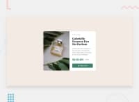
Design comparison


Solution retrospective
What are you most proud of, and what would you do differently next time?
For this project, I continued working with utility classes and began learning about the CUBE CSS methodology. It's still very new to me, so keep your expectations low.
I also learned...
-
... that
margin-inline&margin-block(or padding) is a thing. I'm never going back to just margin! -
... about the visually-hidden class. I still don't fully understand all of the attributes though.
-
... a little more about how to write accessible code.
What challenges did you encounter, and how did you overcome them?
I think accessibility is quite difficult to understand fully. It's probably because I'm not disabled, I never had to use a screen reader or similar. Maybe I need to experiment more before I can fully grasp it.
What specific areas of your project would you like help with?
I would love it if someone could skim through my code and give feedback on the CUBE CSS methodology (I'm certain that I missed a few things), as well as if there are any ways for me to improve my code related to accessibility.
I'm also wondering if it's okay to leave section, div, etc. without a class or aria-label for accessibility? All of my "empty" elements looked so empty in the accessibility tree.
Community feedback
Please log in to post a comment
Log in with GitHub
Join our Discord community
Join thousands of Frontend Mentor community members taking the challenges, sharing resources, helping each other, and chatting about all things front-end!
Join our Discord