


@mattstuddert
Posted
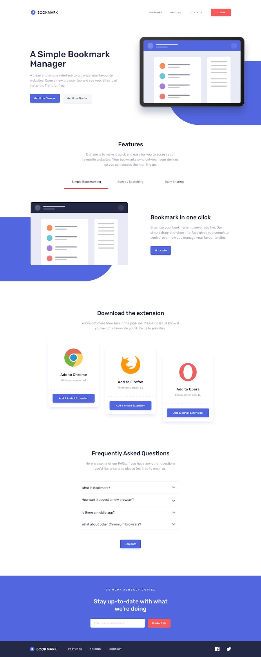
Awesome work on this Marius, the page looks great! 👍
Nice to see you using min-width media queries as well and going with a mobile-first approach. How did you find using that approach vs max-width? Do you prefer it?
Keep up the great work!
@mduboule
Posted
Thank you Matt, I really appreciate you featuring my solution in your last newsletter! To answer your question, I found it somehow difficult because of having to guess what extra markup will be necessary when designing the desktop version… I don't know if this is an issue you've been running into as well. Anyway I had a lot of fun and learned a lot as well so thanks again.
Have a great Summer, Marius
@mattstuddert
Posted
@mduboule you're welcome, you did an awesome job!
I haven't experienced that issue personally, but you could also try getting the skeleton of the layout working for mobile through to desktop first and then start refining the styles from there.
Could be a good way to balance it while you get used to the workflow?
Marked as helpful
