


@mattstuddert
Posted
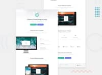
Great work on this challenge Katerina! 👍 I hope you enjoyed it. At the moment the max-width: 1440px media query is stopping me from being able to view the desktop layout though. I'd recommend reducing that value a bit so that it switches to a mobile layout at a smaller screen size.
Keep up the great work!
@katerinamakri
Posted
Hello Matt! Thanks for the feedback. I set this width in a class which I m not using anywhere. I just forgot to delete it from the less file. I want to ask about the structure. Do you have other corrections?
@mattstuddert
Posted
Great, you're welcome! 👍
@mattstuddert
Posted
No problem! You've also got this media query on line 46 of the styles.less file: @media (max-width:1440px) { which is causing the issue I was talking about.
I'd recommend getting used to working with min-width media queries instead of max-width queries. This then optimises the page for mobile users.
If you want to dive into building responsive sites some more, here's a great free course on Udacity that will help.
As far as the structure goes, I'd make it so that all styles aren't nested within body. At the moment it's adding an unnecessary selector for each declaration.
Also, I'd recommend staying away from using IDs as selectors in CSS. They're overly specific and can only be used once on a page.
I hope that helps!
@katerinamakri
Posted
Yes, it helped. Thanks a lot!
