

Submitted
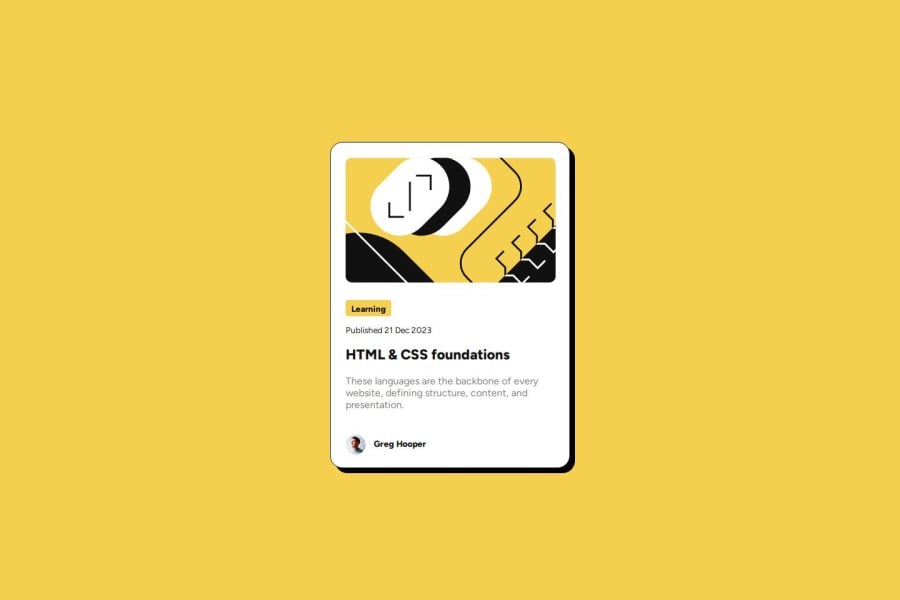
Blog Preview Card with Flexbox and em units for font-size scaling

@fish-ladder

Design comparison

Solution retrospective
What are you most proud of, and what would you do differently next time?
I'm most proud of feeling more comfortable with Flexbox and not needing to look at the documentation so much to achieve the layout I was after.
Next time I will add font-sizes in rems as custom properties in :root to make text scaling easier.
What challenges did you encounter, and how did you overcome them?
-
I thought I had completed the challenge and then realized the font sizes were different in desktop vs mobile layout (should have read the instructions more closely). I needed to revisit my font-size units in order to scale them for the different display sizes.
-
Using Flexbox and auto margins to horizontally and vertically center the main card worked great except that it shoved the attribution element out of view at the bottom of the page. I fixed this by applying auto margins to the attribution element as well.
What specific areas of your project would you like help with?
How can I better organize my CSS code to make it cleaner?
Community feedback
Please log in to post a comment
Log in with GitHub
Join our Discord community
Join thousands of Frontend Mentor community members taking the challenges, sharing resources, helping each other, and chatting about all things front-end!
Join our Discord