
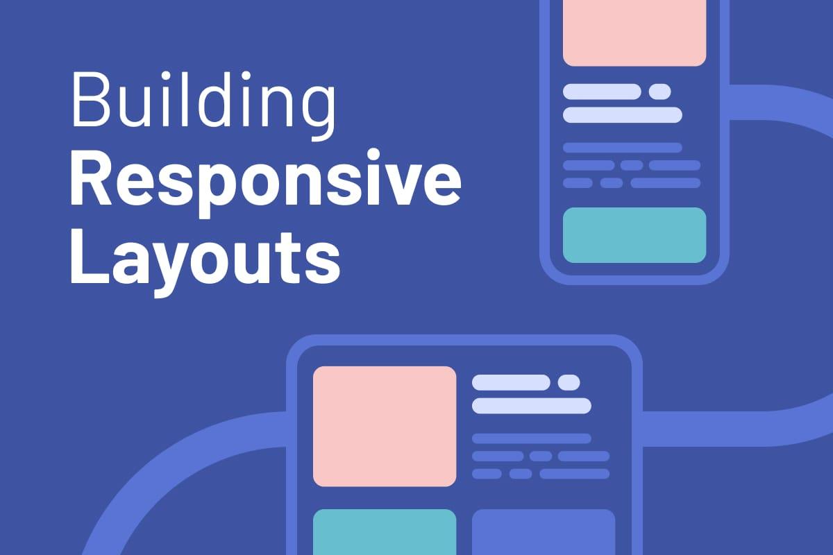
Building responsive layouts
A crucial part of modern front-end development is making web pages look good on various device sizes. The challenges in this path are designed to help you get to grips with making layouts that work across all devices.
✍️ Prerequisites
To tackle this learning path, you need a basic understanding of HTML and CSS fundamentals. If you haven't already completed the "Getting started on Frontend Mentor" path, we recommend starting with that first and then returning here.
💭 Learning outcomes
- Understand responsive design principles
- Master CSS media queries
- Incorporate responsive media and fluid typography
- Learn to use Flexbox and CSS Grid
- Start cross-browser and cross-device testing
Responsive design fundamentals
It's essential to lay a strong foundation in responsive design so that your projects adapt to different devices. In this article, we'll outline the basics and link to some excellent resources.
Not started
Responsive media and fluid typography
Ensuring your media is optimized, and your text is readable on all devices will significantly impact your visitors. In this article, we discuss the key considerations.
Not started
- 1newbieFree
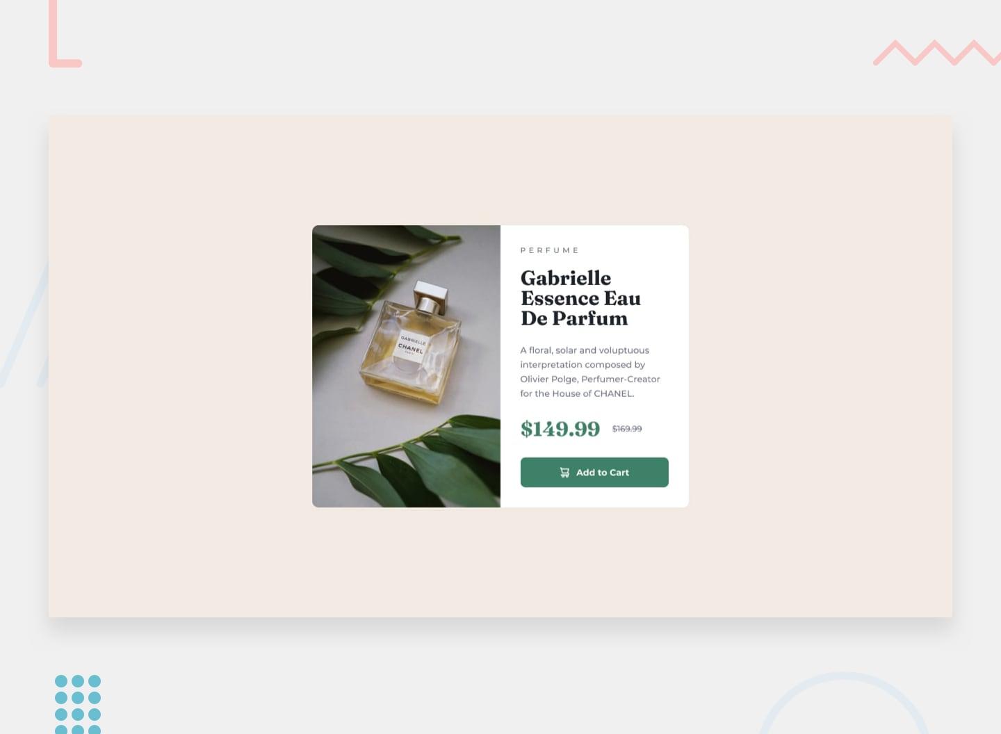
Product preview card component
This HTML & CSS-only challenge will be perfect for anyone starting to build responsive projects.
Not started
Building flexible layouts
CSS has evolved to offer powerful techniques for creating flexible yet robust layouts. This article discusses how you can leverage these tools to help create interfaces that look good everywhere.
Not started
- 1newbieFree
Four card feature section
A nice layout-based challenge for beginners. This will test anyone who is new to multi-column and responsive layouts.
Not started
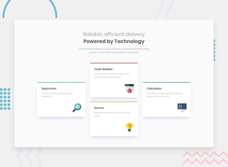
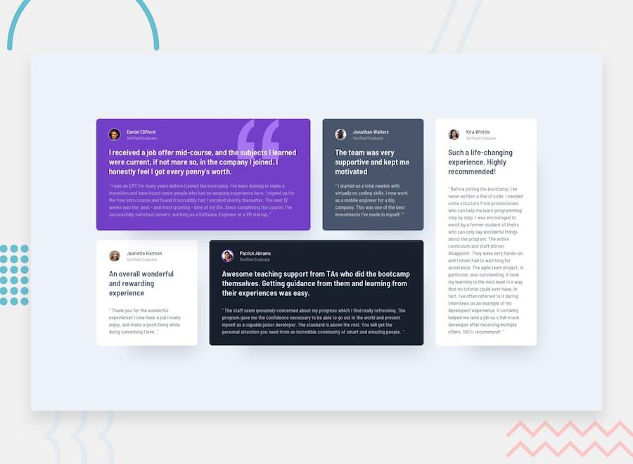
- 2juniorFree
Testimonials grid section
This challenge will be perfect practice for anyone wanting to test their CSS Grid skills. Grid is such a powerful addition to CSS, so it's worth getting to grips with it!
Not started
Cross-browser and cross-device testing
This article covers approaches for ensuring your website behaves as expected across different devices and browsers.
Not started
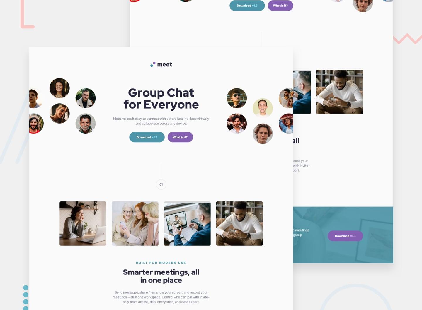
- 1newbiePremium
Meet landing page
This HTML & CSS only challenge is perfect if you're starting to get a bit comfortable with your layout skills. The responsive layout shifts will also be a great test!
Not started