


@mattstuddert
Posted
Great work on this challenge Maria and congrats on submitting your first solution! 👍
Just a quick heads up that the links for your solution are currently in the wrong fields. The live site URL should be the link to the preview and the repo URL should be the link to your GitHub repo. You can edit this easily by clicking on the three dots by the title and selecting "Edit Solution" 🙂
Here are a few pointers after taking a look at your code:
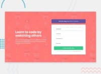
inputelements should always be made accessible to screen reader users. This usual means pairing eachinputwith alabelelement. But if there are no labels in the design you can also add thearia-labelattribute to eachinputelement. Screen readers will then read out this text when theinputis focused.- Nice work making it mobile responsive. One technique you might want to try in a future project is to use
min-widthmedia queries instead ofmax-width. This approach would mean you build out the mobile styles first and then add media queries to account for larger screen sizes. Many people find it to be a more efficient workflow, so would be worth seeing how you get on with it. - You're using
position: absolute;quite a lot, which I'd warn against. This is because it means you're effectively sticking elements to the screen and can become unmanageable when you start to build more complex websites. Instead, I'd recommend learning Flexbox and Grid, which will help you when laying out your elements. Here are a couple of great (and free) tutorials for you to learn more:
I hope these pointers are helpful! Let me know if you have any questions at all.
@mattstuddert
Posted
@mariakourtesi you're welcome! Always happy to help 🙂
@mariakourtesi
Posted
@mattstuddert Hi Matt, thank you so much for your feedback! I really appreciate it, it's fantastic. I honestly, thought that nobody would care to check my code, you are a star! I'll make the changes you suggested. Thank you so much for the tutorials too. Have a lovely day!
