


P
Matt Studdert• 13,611
@mattstuddert
Posted
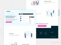
Nice work on this challenge. The desktop version especially looks great! 👍
I'd recommend having the mobile breakpoint at a larger screen size than 375px, because at the moment anyone looking at it on a smaller screen but larger than 375px (376px for example) sees squashed content.
Also, for your next project try giving using min-width media queries a go instead of max-width they have a number of benefits, including loading in fewer styles for mobile users.
I hope those pointers help. Keep up the great work!
0
