


@mattstuddert
Posted
Great work on this challenge Charles! The overall layout that you've created for desktop is really good. I'd say one final revision to try and get the styles to match as closely to the design as possible would be well worth the effort. Also, at tablet sizes the content stretches beyond the screen to create a horizontal scrollbar.
You've done an awesome job, keep up the great work! 👍
@CharlesDesiderio
Posted
@mattstuddert Thanks for the feedback! Despite owning one, I tend to forget that tablets even exist, but going forward I'll make sure that all my projects look great across all devices. I even found a great resource with breakpoint sizes for all major devices. When you mentioned trying to get the styles to match, what specifically stood out to you? I took a closer look and noticed that I didn't set the font weight on the buttons, but was there anything else that you think is off the mark?
@mattstuddert
Posted
@CharlesDesiderio no problem! Yeah, those small details really do make all the difference. It's well worth spending that extra time refining each project and really matching up as much as possible to the design.
@CharlesDesiderio
Posted
@mattstuddert No worries, being nitpicky helps! 😂 I might not have noticed these differences otherwise! Like the difference between font-weight: 500 and font-weight: bold is a small one, but once you see it, it's super obvious. Thanks again for all the help!
@mattstuddert
Posted
@CharlesDesiderio you're welcome! Yeah, I always find tablet screen sizes the most fiddly to work with. That's great that you've found a good resource for major device sizes.
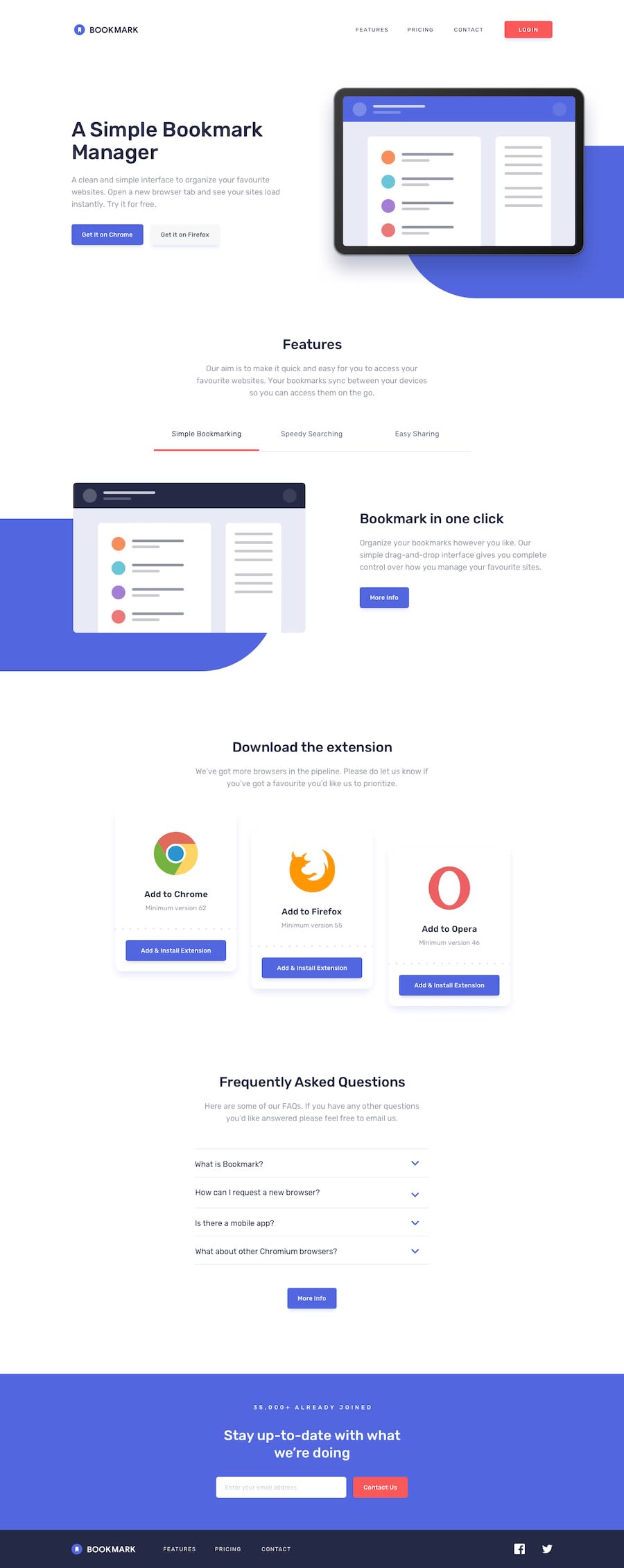
As for the styles, it's me just being slightly picky 😅 At the moment, font sizes and spacings are a little off in the intro section and the blue decorative background element should be fully rounded with no straight edge on the side. The color of the paragraph in the tabbed feature section is also different from the design and the font-weight is a little off on the FAQ accordion.
These are all very small issues though, you've done an awesome job with this challenge. It looks great! 👍
